From How I See It
This page will show you how different people have customized their text display so they can read easier. Here are just a couple for now. More coming soon. If you want to share your optimized text display, please send it to projects@uiaccess.com
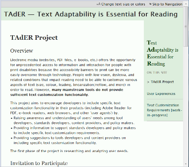
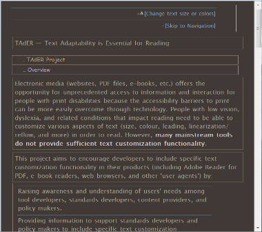
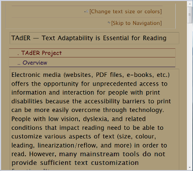
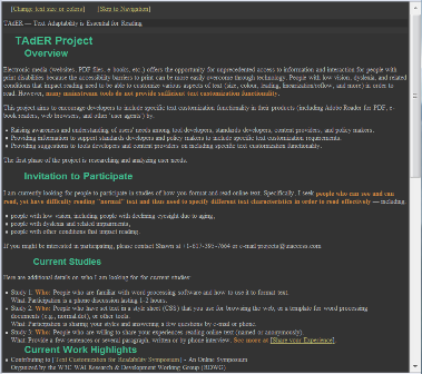
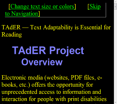
The first screen capture shows a web page with author styles. The next show the same page with user style sheets applied. These show text display settings including:
- Content is linearized so the navigation that is floated right with the author style is displayed at the bottom with the USS.
- Headings are a different font family, color, and indentation. Some have different borders and dots preceding them. Some headings are smaller than the main text.
- Links are surround by brackets and are different colors.
- <strong> and <em> are different colors and font family.
- Some lists are displayed with borders and no bullets.
For More Information
Shawn Henry
+1-617-395-7664
projects@uiAccess.com