User Experiences
The user experiences linked from this page provide insight into how real people with low vision, dyslexia, and related conditions that impact reading interact with electronic text. They specifically focus on the need to customize text display for readability.
These are all real people sharing real issues, not fictional personas. (Angelita and Sandra are different names used for anonymity.)
Most names below are linked to more details.
- Angelita — vision ranges from 20/100 to 20/700, needs dark background; white is painful
- Each day I see differently depending on the level of inflammation in my cornea. I need inverse contrast; white backgrounds create blinding glare that is very painful. I need different levels of magnification for different content, even for different elements in a single document. I sometimes save PDFs as text, but then I lose all the visual aspects. I want to be able to customize the style in PDF. When things work, it's great! For example, with the iPad I can now read to my son as never before. However, things often don't work. Most days I walk away from my PC discouraged, in significant pain, and completely fatigued.
[Read more in "Confessions of a Miserable Low Vision Computer User".] - Ben — no significant "disability", yet uses user stylesheets to make text more readable
- I'm just a geek in glasses. I have an unremarkable level of short-sightedness that's not really considered a disability — yet I regularly have problems with small, low-contrast text and have to increase its display to read it comfortably. I use user stylesheets to increase text size, line height, and contrast in specific websites. As a developer, this isn't hard for me, but I've no idea how the average user would do it.
- James — dyslexia; customizes contrast, typeface, and capitalization
- I was diagnosed with dyslexia when I was 11. Contrast: Stark contrast of black on white is difficult for me for longer than a sentence. I really need to be able to set the colours myself, presets don't work. Someone else's idea is useless. Typeface: I like Helvetica and Arial; Times is a horrible font to read. Lines: Line width is important; I struggle to get to the start of the next line. Capitalization: I write and read better with all caps.
- Matt — diabetic retinopathy, prints PDF for CCTV
- I've had diabetic retinopathy since I was 24. I use reverse polarity - yellow text on black background. This works for most applications and web pages. If I get a Word doc, I'll change the font to 16 pt. If I get a PDF, I print it and use CCTV (which magnifies it). I also use a magnifier mouse. With it I can have the overall screen with smaller text so I can see more, then I can magnify the part that I want to read.
- Mike — ageing eyes, increases text in browser, line spacing of 1.5 for documents
- I find that the high resolution of larger screens renders the type too small for me, especially at the end of the day when my eyes are tired. I use the Windows OS to increase the size of text to Medium (125%). For web browsing, I use the NoSquint add-on and zoom text 125% — I increase just the text, not zoom the entire screen, which I find a bit disorienting. For Word, I have a shortcut to change the view; I usually use 125-150%. I have my normal.dot template set to 1.5 line spacing and black text on white. I prefer Bookman Old Style, which is a font with more letter spacing and broader kerning.
- Ramón — retinitis pigmentosa, light text on dark background, user style sheet, gave up on PDF reflow
- I have retinitis pigmentosa which causes a narrow field of vision (about 5 degrees) and very poor contrast sensitivity, yet I still have a relatively good visual acuity. I need light text on a dark background. I sometimes use the high contrast setting in the OS, but it doesn't work well in some programs. Sometimes it will pick up one of the colors but not the other (e.g., background but not text, or viceversa), which makes the text invisible or almost unreadable due to its low contrast. I use Firefox and the Stylish add-on with a global style sheet, as well as the zoom-text-only feature. I've tried PDF reflow but it usually doesn't work well (e.g., graphics overlap text, or simply the PDF is not properly developed to reflow), so I gave up on it.
- Sandra — post-cataract, ageing eyes (age 60), increases font size and line spacing
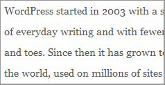
- One's eyes are amazing in the way they adapt and focus - you only realise how amazing when you have to make a few adjustments to help them along. I find with some text my eyes straining to adapt. I figured out that increasing the line spacing made reading better for me after I noted that several Wordpress blogs were easier to read, and my eyes and brain felt relaxed and engaged with what I was reading. To comfortably read text online, I need larger font, more line spacing, and a slightly reduced line length.


These user experience stories are part of the TAdER Project to encourage developers to include specific text customization functionality in their products — including Adobe Reader for PDF, e-book readers, web browsers, and other 'user agents'.
Please learn more about:
Date: First posted 2012.