[ See more user experiences. Learn about the TAdER Project. ]
[Draft] Shawn's User Experience

Summary
I have a demyelinating disease that impairs my vision and causes other problems. It is relapsing-remitting, which means it comes and goes. I increase the DPI at the system level for an overall 150% zoom. My default browser setting is 120%-150% zoom and I have a user style sheet to increase leading (space between lines) and remove underlines from links. I almost always reformat documents for reading, which I can do easily with Word. I often cannot read more than a couple sentences in PDF documents without significant difficulty, even tagged PDF (so called "accessible PDF", though it's not accessible to me).
On this page:
My vision


Most of the time I can read 16-20pt text with 1.15-1.5 leading, although I can read a short amount of 'normal' text with some difficulty. In good times, I can read even 11pt text without much difficulty. At worst, I cannot read more than a couple words, even large text. (Over the last 15 years, this has only been the case a couple times.)
My vision varies because I have relapses/exacerbations and then periods of remission. These usually last several weeks or months. My vision is also impacted by medication and fatigue.
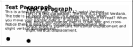
I get blurry vision, double vision (diplopia), and slight nystagmus. (vision issues info) The blurry vision is not correctable with glasses. When the double vision flares up, it is worsened by fatigue, heat, and stress. I can usually strain to keep things readable, but as soon as I don't focus for a fraction of a second, the words overlap again. Sometimes this is only a problem at the end of a hot, stressful day; and sometimes it is a problem no matter what. I have occasionally used prisms to try to help with the double vision, but they are not sufficient for reading very much.
I'll admit to starting to have impacts from aging eyes now, too. My eyes really have trouble focusing with reading glasses on. Guess it's time to go back to the neuro-ophthalmologist...
Print vs. online
It is difficult for me to read much text at my desk; it's better if I print it out and read it in a more comfortable position — although I don't like to spend a lot of paper and ink on printing. Sometimes I'll take my laptop to the recliner to read more comfortably, but it has a small screen. Also, a lot of thing I need to make notes on. This is a significant problem with PDF, since it can't be printed zoomed or reflowed.
PDF barriers
PDF is not accessible to me because I cannot sufficiently format the text to make it readable. (see Optimizing format below) Even tagged PDF is not; therefore, I am quite uncomfortable with so called "accessible PDF". The last two years I've been doing a Master's degree program that involves reading lots of conference papers, which are usually provided only in PDF.
Adobe Reader does not provide functionality for users to set font face, text size for specific elements, leading/line spacing, and most other aspects of text formatting. It does provide zoom; however, documents with some layouts are not functionally readable when zoomed, such as research papers formatted in two columns. It provides reflow that temporarily puts text in a single column; however, it only works for some documents (reflow text in a PDF) and is very buggy-often some information is lost in reflow mode.
Web use
My default browser setting is usually 120%-150% zoom and I have a user style sheet to increase leading (space between lines) and remove underlines from links. I typically increase and decrease zoom 'on the fly' as I use the Web, which is a single keypress in Opera (0 to increase, 9 to decrease). I've used Opera browser for years because of their zoom functionality - they implemented it way before other browsers did.
Most pages I can get sufficient legibility easily. Some things mess up, for example, text overlapping. I think some of this is due to my system settings for large fonts, but I haven't taken the time to figure it out.
When I want to read a lot of text, I save the file locally and reformat the text for readability.
Optimizing format
I regularly get a document from a non-profit organization that I reformat for readability. Here are notes on what I do:
- Select all text and change it to:
- 14-20 pt, depending on how my eyes are doing then
- This does lose the size differentiation of the headings; however this is a simple document with one level of headings and little else bold, so it works. Sometimes I'll increase all text proportionally, but then the headings are too big and waste space. For more complex documents, I'd need to do more customization based on styles, e.g., change heading different from main text.
- Increase the text size more for things I'll need to read more carefully
- Times New Roman
- black
- leading of 1.15 or 1.5, depending on how my eyes are doing then (sometimes a setting in between would be better, but since two options take less clicks, I usually use them)
- undo italics
- 14-20 pt, depending on how my eyes are doing then
- Change ^p^p to ^p and set spacing between paragraphs
- Find & replace two spaces with one. (This may be because of my background in document design rather than a visual or cognitive processing preference. :-)
- The following are to save paper, not to optimize readability
- Set margins to 0.20. (It would be easier for me to read with somewhat shorter lines; however, I prefer to use less paper.)
- Delete anything I can do without so as to use less paper and ink.
- View two pages at a time and:
- move split paragraphs on to one page if there's only a couple of lines on the first page (so don't lose reading flow going from one page to the next)
- optimize for number of pages (to save paper), e.g., if there's one line on the last page, tweak something so it goes on the previous page - or if there's half a page empty, increase font size or spacing to fill it up.
- Print it.
System settings
I've the changed the following settings to improve legibility:
- DPI: 144, which is 150% (and more than the the preset option for "Larger scale" which is 120 DPI)
- Mouse pointer settings: Windows Black extra large
- Make the focus rectangle thicker.
- Increased the thickness of the blinking cursor.
- @@ light blue background
I use a @@ inch monitor. A couple days a month I'm traveling and use a laptop with a @@ inch screen.
@@ dialog boxes too tall and can't see the buttons at the bottom - including Acrobat Pro on my large monitor...
