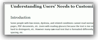
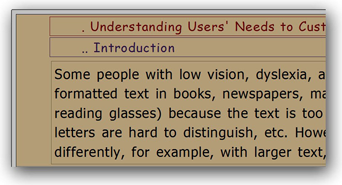
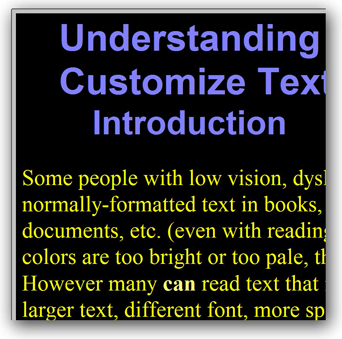
Examples of text customized


Understanding Users' Needs to Customize Text Display
Introduction
Some people with low vision, dyslexia, and related conditions cannot read normally-formatted text in books, newspapers, manuals, web pages, PDF documents, etc. (even with reading glasses) because the text is too small, the colors are too bright or too pale, the letters are hard to distinguish, etc. However many can read text that is formatted differently, for example, with larger text, different font, more spacing, etc.
In order to read, some people need to change the way text is formatted; they need to be able to customize the text display aspects.
Summary
This page explains users' needs for customizing text:
- Millions of people cannot read normally-formatted text, and millions more will not be able to in the coming years as their vision declines due to aging. Who needs to customize text (user group)
- Text could be somewhat legible to a user, yet not functionally readable; that is, with effort a user could distinguish one letter from another, but could not effectively read sentences because of the text formatting. Readability beyond legibility
- Some people cannot read normally-formatted text at all and other people experience pain, strain, fatigue, frustration, dizziness, nausea, difficulty seeing, difficulty understanding, and more. When text is not customized
- Users' needs can conflict with general best practices or designers' aesthetic choices. One user’s needs can conflict with another user’s needs. Without customization there are conflicts
- Screen magnification software is not a viable solution for some people. Adaptive strategies fall short
- For formal references, see Referring to this material.
Who needs to customize text (user group)
Millions of people cannot read normally-formatted text, and millions more will not be able to in the coming years as their vision declines due to aging. An estimated 15–20% of the population has symptoms of dyslexia, and 246 million have low vision (compared to 39 million who are blind). [stats]
Text customization is needed by the largest groups of people with "print disabilities"[print]: those who can see and can read, but have difficulty reading normally-formatted text and need change the way text is displayed in order to read effectively; including:
- people with low vision,
- people with dyslexia,
- people with other visual perceptual impairments and conditions that impact reading.
The needs of people with declining abilities due to ageing are becoming more and more of a priority for software design.
(While some people need text customization, others with 'situational limitations'[note] can benefit from it, for example, people without disabilities reading in a car with low light when they are tired.)
Readability beyond legibility
In order to understand the needs of people to customize text for reading, it is important understand the distinction between legibility and readability. Legibility is related to perceiving text by distinguishing letters. Readability is related to reading and comprehending textual information. [readability] Thus text could be somewhat legible to a user, yet not functionally readable. That is, with effort a user could distinguish one letter from another, but could not effectively read sentences because of the text formatting.
For example, in a User Research Survey, respondents commented to the question, "What happens when you read "normal" text, such as a newspaper, or text on a computer that is not displayed how you like it, such as a pale text on a bright background?":
- "My comprehension decreases -- that is, the smaller the print, the less willing my eyes are to READ. So, for example, I can read small print on a map (labels) but not small print in a news story."
- "Words and letters begin to blur together. Lines of text are easy to confuse with one another. Some letters such as b, p, q and d or i and j become jumbled and seem interchangable with one another. I sometimes begin to read lines vertically instead of horizontally, especially if text is justfied on a screen."
- "I can only see one or two letters at a time and my eyes jump around and not track across a sentence."
When text is not customized
Some people cannot read normally-formatted text at all. Some people can read it with varying difficulties. For some (such as Ben), being able to customized text is a convenience; for others (such as Ramón and Angelita), being able to customized text is a requirement.
When asked what happens when people read "normal" text, or text on a computer that is not displayed how they like it, User Research Survey respondents said they experience:
- significant pain and headaches
- strain and discomfort
- fatigue
- frustration
- nausea, dizziness
- difficulty seeing
- difficulty understanding
Sometimes people give up. More than half of the survey respondents "quit reading information from the computer (such as an article on the web or instructions in PDF) and not finish it, just because the text is too hard to read comfortably" often every day or a few times a week.
Please see When Text is Not Displayed Well for enlightening comments and survey data.
Without customization there are conflicts
There is not a single text format that will meet most users' needs. Research results and published guidelines have different recommendations for specific aspects of text format. For example, leading/line spacing recommendations for people with low vision, dyslexia, or who are older, range from 1.25 to 2.0. [guides] A study of user style sheet settings found that some people (7) set a sans-serif font; some (3) set a serif font, and some didn't set the font at all. Font-family settings were: sans-serif, Verdana, Arial, Helvetica, Trebuchet MS, Times/Times New Roman, and APHont.
Without customization, a user's needs can conflict with general best practice. For example, in a study on how people customize text with RTF and PDF files, a participant with dyslexia said, “I write and read a lot better in all upper case”; whereas, all guidelines I've found suggest avoiding all caps, for example, those listed in the references.
Without customization, a user's needs can conflict with visual designers' aesthetic choices. For example, respondents to the User Research Survey commented:
- "low contrast (gray text) as is popular on web sites even on a bright white background creates discomfort, even when only slightly gray, such as #333333. This constant fight shortens my effective day."
- "I am so annoyed at designers who put pale gray text on a slightly gray background. I find this on the iPad and iPhone and it is unacceptable."
Without customization, one user’s needs can conflict with another user’s needs. For example, many people with declining eyesight due to ageing need high contract between text and background color; whereas many people with dyslexia and other reading impairments need low contrast. [contrast] Most text is displayed as dark text on light background; however, some people cannot read with bright backgrounds and need light text on dark background. User Research Survey comments included:
- "White background and black text is my least preferred method of viewing. White distorts the letters."
- "If I try to read light on dark texts after a few lines all I can see is stripes."
- "It becomes a strain to read documents that are not made easy to read through magnification or color scheme changes such as white lettering on black background."
- "Pale text on a bright background is less problematic than dark text on a bright background. But a bright background is always a problem."
- "Text with low contrast or too much contrast is wrong for my eyes."
The study of user style sheet settings found that people set conflicting colors. Of those analyzed, 6 set dark text on light background; 5 set light text on dark background; (some didn't set colors). Most color settings were high contrast (21.00:1) black and white. One global style sheet set low contrast of 4.75:1.
Not only are there differences between users, individual user’s needs are sometimes different depending on their situation. Participants in the RTF-PDF Study and respondents to the User Research Survey reported that their needs varied depending on the amount of text to be read, the time of day, fatigue, and the complexity of the information.
All these potential conflicts clearly point to the requirement for users to be able to customize text according to their specific needs at a given time.
Adaptive strategies fall short
Magnification
Some people who need larger text use screen magnification software to increase text size (and images and everything else), change colors, and sometimes read text aloud. However, screen magnification has drawbacks. Angelita says:
"I absolutely hate using the leading adaptive screen enlargement programs like Zoomtext and Magic because they tend to enlarge every image equally and waste a lot of space on the screen."
Screen magnification software often requires people to scroll horizontally to read lines of text; however, some people cannot effectively read text that requires horizontal scrolling. Survey respondents commented that horizontal scrolling with screen magnification software made them nauseous, disoriented, and frustrated.
Screen magnification does not allow users to customize many aspects of text display.
Screen magnification software is not a viable solution for some people because of insufficient functionality, complexity, availability, cost, or other factors.
Copy, paste, customize
When people are using a program that doesn't support text customization (or it's too hard to figure out), a common strategy is to copy text (e.g., from a web page), paste it into a word processing program, and customize the text there. For example,
- "Before I knew how to apply stylesheets to any web page, I used to copy the text from a web page and paste it into Word or other text editor so I could format it to read it." — Ramón
- "Reading some web text requires me to copy it into Word, increase font size, adjust colors, and increase margins to insure that text reflows properly. These text gymnastics are tedious and time consuming." [Ley]
- "When he encountered text on a Web page that he found difficult to read, he would copy the text into Word and enlarge it appropriately, since he knew that Word allowed him to customize text appearance." [Sloan]
- "I will copy and paste the text it a format that I can adjust the text to my reading comfort.", "I sometimes paste things into a word document and make my own format so i can use the information", and 9 other comments from the User Research Survey
Copy and paste also has limitations. Often the semantic markup is lost in copy and paste, for example, headings and lists are not preserved so the paste looses formatting to distinguish elements.
Referring to this material
Please be careful in referencing the information on this tader.info website as from the individual Shawn, not related to her employer.
Some of the information on this page is published in peer-reviewed papers, which might be better for referencing in scientific papers and such. See Research for links to the papers.
Depending on what format you use, a reference for this page might be:
Henry, Shawn Lawton. (2016) Understanding Users' Needs to Customize Text Display. Available: http://www.tader.info/understanding.html. Last accessed 4 January 2016.
See also
- Text Customization for Readability for an introduction to the big picture issue.
- User Experiences for personal stories that provide insight into how real people with low vision, dyslexia, and related conditions that impact reading interact with electronic text.
- Example text displays of how people have customized their text.
Notes and References
About 'situational limitations':
Accessibility also makes products more usable by people in a wide range of situations. Situational limitations come from circumstances, environments, and conditions, and can affect anybody—that is, people without disabilities as well. For example, situational limitations include using the Web on a mobile phone when your eyes are busy (such as driving), in bright sunlight, in a dark room, when your hands are full, in a quiet environment (where you don't want it to make noise), in a noisy environment (where you can't hear well), and in an emergency (when you may not be thinking clearly). Thus, while access to people with disabilities is the primary focus of accessibility, it also benefits people without disabilities and organizations that develop accessible products because designing for functional limitations overlaps with designing for situational limitations. — from Background | Just Ask: Integrating Accessibility Throughout Design
Statistics
- International Dyslexia Association. (2008) Dyslexia Basics. http://eida.org/dyslexia-basics/
- Steinmetz, E. (2006) Americans with disabilities: 2002, Washington, DC: U.S. Census Bureau. (Current Population Reports, P70–107)
- World Health Organization. (2011) Fact Sheet # 282: Visual Impairment and Blindness. Geneva. http://www.who.int/mediacentre/factsheets/fs282/
Print Disabilities
- Reading Rights Coalition. (n.d.) The definition of "print disabled". http://www.readingrights.org/definition-print-disabled
Readability
- Tracy, Walter. (1986) Letters of Credit: A View of Type Design. London: Gordon Fraser.
- Tinker, Miles A. (1963). Legibility of Print. Iowa: Iowa State University Press.
Note: In his seminal research, Tinker used only the term legibility to avoid confusion with readability formulas for the level of difficulty of the language; however, most recent literature distinguishes between legibility and readability as explain on this page.
Adaptive Strategies
- Ley, Eileen Rivera. (2012) When One Size Fits One — A Position Paper on Achieving Readability for People with Low Vision Through Web Text Customization. In Proceedings of the W3C WAI Symposium on Text Customization for Readability. Henry, S.L. and Sloan, D. (Eds.). Available at www.w3.org/WAI/RD/2012/text-customization/p13
- Sloan, David. DSloan@computing.dundee.ac.uk. [TC4R Symposium] - comments on supporting text customization for older Web users. 19 Nov 2012. Available: http://lists.w3.org/Archives/Public/public-wai-rd-comments/2012Nov/0006.html
Recommendations
- Arditi, A. (1999, 2002) Making Text Legible: Designing for People with Partial Sight. New York: Lighthouse International.
- Bix, L. (2002) The Elements of Text and Message Design and Their Impact on Message Legibility: A Literature Review. Journal of Design Communication, No. 4. http://scholar.lib.vt.edu/ejournals/JDC/Spring-2002/bix
- British Dyslexia Association. (n.d.) Dyslexia Style Guide. http://www.bdadyslexia.org.uk/about-dyslexia/further-information/dyslexia-style-guide.html
- Calabrèse A, Bernard JB, Hoffart L, Faure G, Barouch F, Conrath J, Castet E. (2010) Small effect of interline spacing on maximal reading speed in low-vision patients with central field loss irrespective of scotoma size. Invest Ophthalmol Vis Sci. 2010 Feb;51(2):1247-54.
- CCLVI. (n.d.) Best Practices and Guidelines for Large Print Documents used by the Low Vision Community http://www.cclvi.org/large-print-guidelines.html
- The Center for the Partially Sighted. (n.d.) Print Guidelines http://low-vision.org/en/Print_Guidelines
- Hartley, J. (1999) What does it say? Text design, medical information, and older readers. In D.C. Park, R.W. Morrell, and K. Shifren, eds. Processing of Medical Information in Aging Patients, 233-48. Mahwah, NJ: Lawrence Erlbaum Associates.
- Holt, B. (2000) Creating Senior-Friendly Web Sites. Center For Medicare Education Issue Brief 1(4):1-8.
- Kitchel, J.E. (n.d.) APH Guidelines for Print Document Design. http://www.aph.org/edresearch/lpguide.htm
- Morrell, R. W., Dailey, S. R., Feldman, C., Mayhorn, C. G., & Echt, K. V. (2002) Older adults and information technology: A compendium of scientific research and Web site accessibility guidelines. Bethesda, MD: National Institute on Aging.
Contrast
- Morrell et al 2002 (above)
- Holt 2000 (above)
- Gregor, P. and Newell, A. (2000) An empirical investigation of ways in which some of the prob-lems encountered by some dyslexics may be alleviated using computer techniques. In Proceedings of the fourth international ACM conference on Assistive technologies (Assets '00). New York, NY, USA: ACM, 85-91.
- Holt, B. (2000) Creating Senior-Friendly Web Sites. Center For Medicare Education Issue Brief 1(4):1-8.
Date: Updated 2 January 2016. First posted 2013.